AP Statistics · Unit 1 · Class 2 of 8 · Grades 10–12
AP Statistics Class 2 — Displaying Categorical Data
The second 2-hour class of SOMATH’s AP Statistics arc: how to summarize a single categorical variable with a frequency (or relative-frequency) table and a bar chart, why pie charts almost always lose to bar charts, how to build a two-way table for two categorical variables, and how to read marginal, joint, and conditional distributions. Full theory with worked-through SOMATH charts, plus 20 original practice questions with click-to-reveal step-by-step answers, ending with an intro to Simpson’s paradox.
In Class 1 we defined the vocabulary of AP Statistics: population vs. sample, parameter vs. statistic, categorical vs. quantitative. Class 2 picks up where Class 1 left off and answers the natural next question: once you have data on one or two categorical variables, how do you summarize and display them so a reader can actually see what’s going on?
That’s all of Class 2. For a single categorical variable, you make a frequency table (and its cousin, the relative-frequency table) and display it with a bar chart. For two categorical variables at once, you make a two-way table and display it with a side-by-side bar chart or a segmented (100%-stacked) bar chart. Then you learn three ways to slice the two-way table — marginal, joint, and conditional distributions — and use them to decide whether the two variables are associated. At the very end we peek at Simpson’s paradox, the classic warning that pooling two subgroups can flip the answer.
All charts on this page are original SOMATH visuals built from small classroom-style datasets we invented for teaching. Every practice question is 100% written by SOMATH teachers. If your student wants a structured in-person path through the AP Statistics exam, book a free 30-minute in-person diagnostic evaluation or call (646) 668-6151.
Class 1 recap — the vocabulary in one sentence
Before we dive in, one-sentence recap of Class 1: a population is the whole group you want to describe; a sample is the subset you actually measured; a parameter (Greek letters) is the true number about the population; a statistic (Roman letters, hats) is the number you compute from the sample. Categorical variables label groups; quantitative variables measure amounts. Class 2 is entirely about summarizing and displaying categorical variables.
Displaying one categorical variable — frequency tables and bar charts
Say a SOMATH classroom surveys 34 students on their favorite math topic. The raw data are 34 category labels: Geometry, Algebra, Word problems, and so on. The first summary is the frequency table — a two-column table listing each category and its count:
| Favorite topic | Frequency (count) |
|---|---|
| Geometry | 11 |
| Algebra | 9 |
| Word problems | 6 |
| Statistics | 5 |
| Number theory | 3 |
| Total | 34 |
The relative-frequency table is the same table with each count divided by the total (and typically expressed as a percent):
| Favorite topic | Frequency | Relative frequency |
|---|---|---|
| Geometry | 11 | 11 / 34 = 32.4% |
| Algebra | 9 | 9 / 34 = 26.5% |
| Word problems | 6 | 6 / 34 = 17.6% |
| Statistics | 5 | 5 / 34 = 14.7% |
| Number theory | 3 | 3 / 34 = 8.8% |
| Total | 34 | 100.0% |
Relative frequencies of a single categorical variable always sum to 100% (up to small rounding). If yours don’t, either a category is missing or an observation is double-counted.
Chart 1 — Single-variable bar chart (favorite math topic)
Below is a bar chart of one categorical variable — favorite math topic among 34 SOMATH students. Each bar is one category, bars are separated (not touching), and the height of the bar is the count in that category.
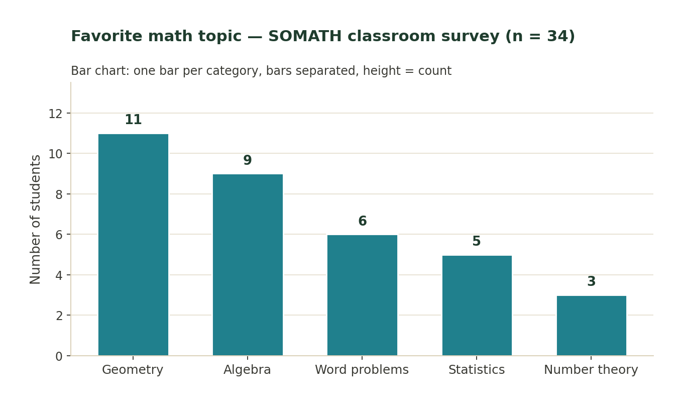
What to notice: bars are ordered from highest to lowest count (Pareto order). The bars have gaps between them — unlike a histogram, where bars touch, because bars in a bar chart represent separate categories, not intervals on a number line.
Chart 2 — Same data, as a relative-frequency (percent) bar chart
Take the same data and divide each count by the total (34). Now the bar heights are percents that add to 100%.
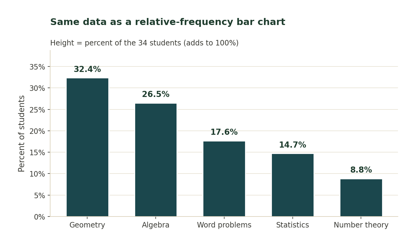
What to notice: the shape is identical to Chart 1 — the y-axis just changes from counts to percents. Use relative frequency when you want to compare two groups of different sizes (Chart 4 below) or when the total is very large.
Chart 3 — Side-by-side (grouped) bar chart of two-way data
When there are two categorical variables, one common display is the side-by-side bar chart. Each category on the x-axis gets one bar per group.
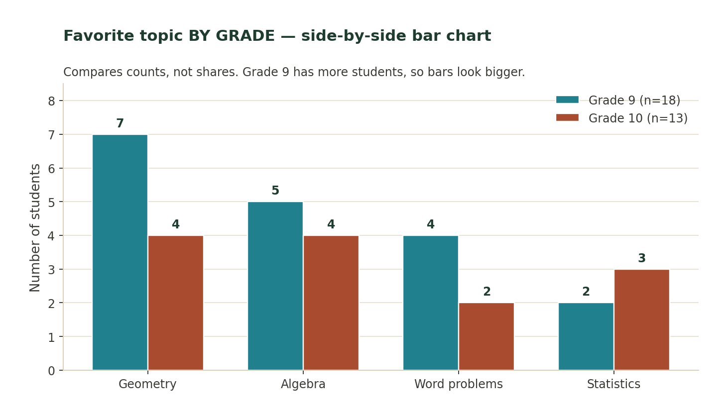
What to notice: side-by-side bar charts compare counts, not shares. Because Grade 9 has more students, Grade 9 bars tend to be taller everywhere — even for topics where Grade 10 has a bigger share of its class. To fix this, switch to a segmented bar chart (Chart 4).
Chart 4 — Segmented (100%-stacked) bar chart of conditional distributions
A segmented bar chart shows the conditional distribution of one variable given each value of the other. Every bar is scaled to 100%, so what you compare is shares, not raw counts.
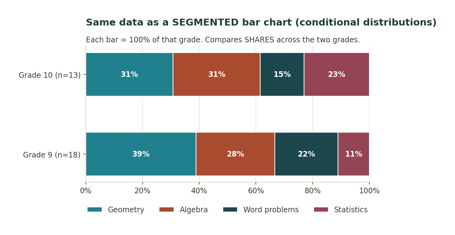
What to notice: compare the SAME COLOR across the two bars. Statistics (the rightmost color) takes 11% of Grade 9 but 23% of Grade 10 — so Statistics is a bigger share of Grade 10 preferences, even though the raw count in Grade 10 (3 students) is smaller than in Grade 9 (2 students). If the two bars had identical stripe widths, the two variables would be (roughly) independent. Because the stripes differ, favorite topic and grade level are associated.
Chart 5 — Same data as a pie chart
Pie charts show the same single-variable relative frequencies as Chart 2, but as wedges of a whole. Pie charts get harder to read as the number of categories grows, and comparing two pie charts (say, this year vs. last year) is very hard.

What to notice: we can see Geometry is the biggest slice, but ranking Algebra vs. Word problems vs. Statistics visually is much harder here than in Chart 1. AP graders and professional communicators default to bar charts.
Chart 6 — Misleading vs. honest y-axis
The same three bars, plotted two different ways. The left panel is truncated (y-axis starts at 80). The right panel is honest (y-axis starts at 0).
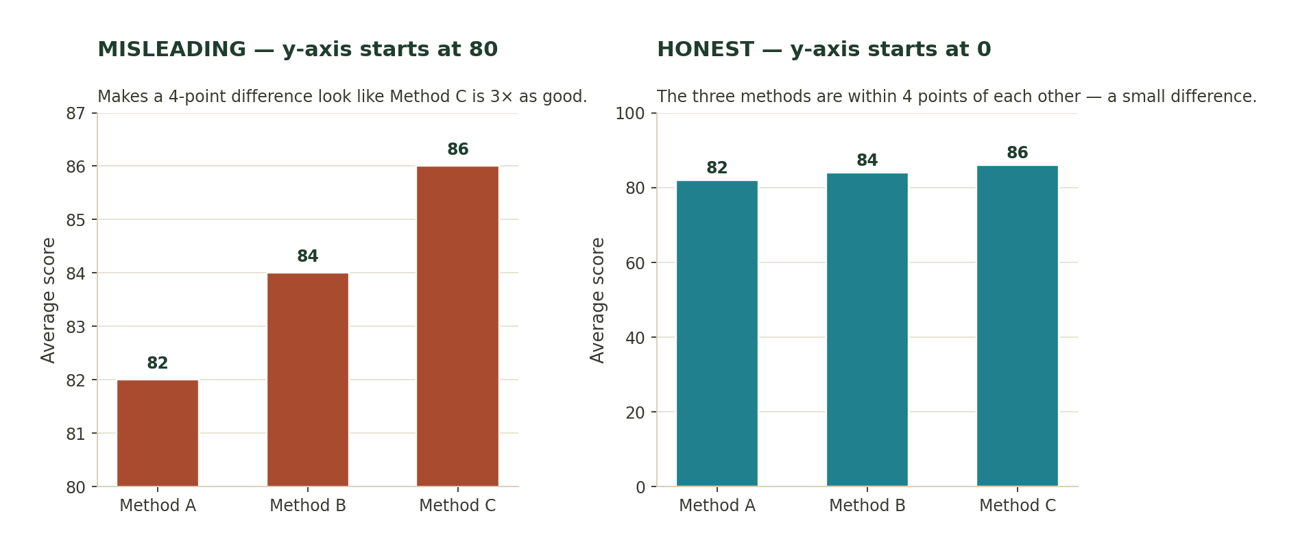
What to notice: when the y-axis is truncated (left), a 4-point difference on a 100-point scale looks like Method C is 3 times better than Method A. On the honest chart (right), the three methods are visibly almost identical. First move when you look at any bar chart in the wild: check where the y-axis starts.
Chart 7 — Simpson’s paradox: the pooled bar can flip the story
SOMATH runs two tracks: Enrichment (an easier track where most students succeed) and Test Prep (a harder track). Each track is offered both in-person and online. Within each track, in-person students succeed at a higher rate. But because most online students are enrolled in the easier track, the pooled overall rate reverses the ranking.
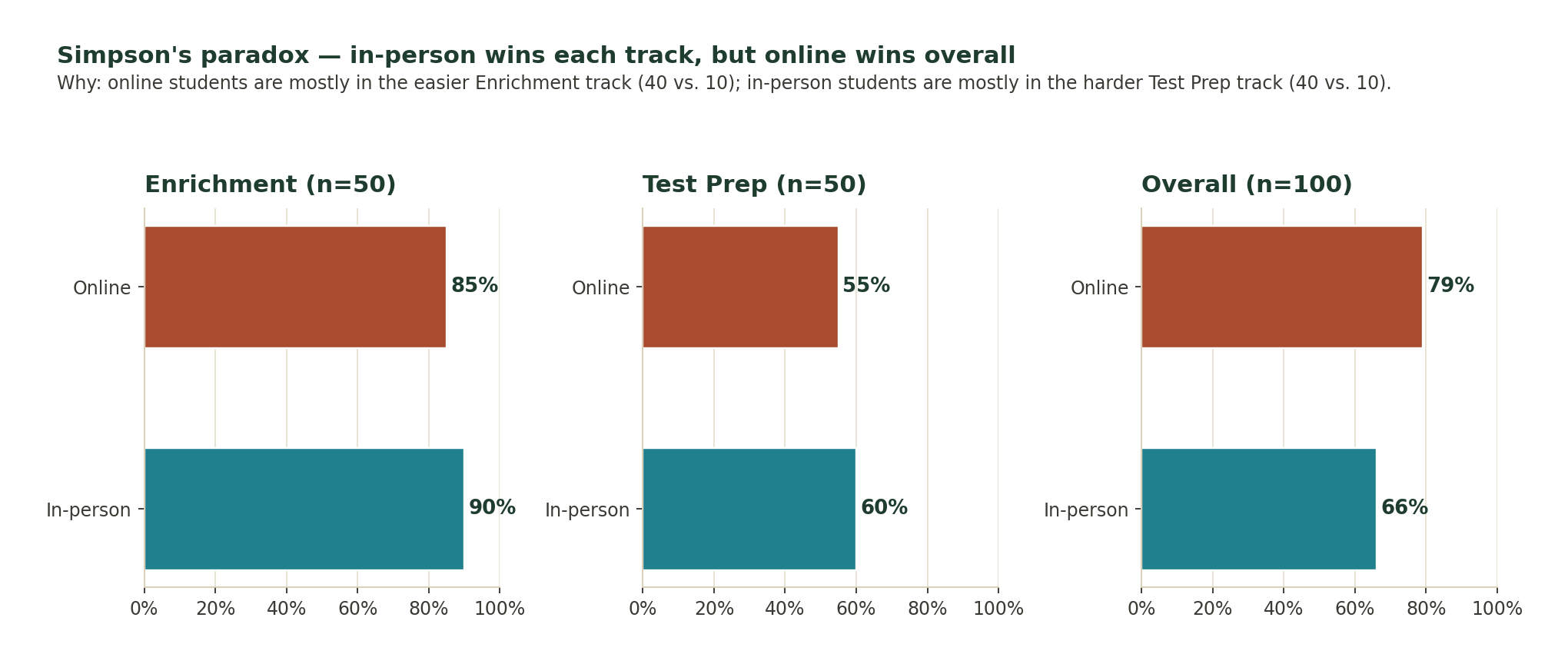
What to notice: in-person wins each track (90% vs. 85%, and 60% vs. 55%) but loses overall (66% vs. 79%). The reversal happens because online students are concentrated in the easier track. This is called Simpson’s paradox. The honest answer to “which format is better?” here is in-person, using the within-track comparisons — the pooled bar hides the effect of the enrollment imbalance.
Bar charts vs. pie charts
Chart 5 above is the same data as a pie chart. Pie charts are visually familiar but almost always harder to read than a bar chart of the same data, for two reasons:
- Human eyes read length very accurately and angle very poorly. Comparing bar heights beats comparing wedge angles at almost every question.
- Pie charts get worse quickly as the number of categories grows. Beyond 4 or 5 slices they become a color-guessing game, and comparing two pie charts (year over year, say) is genuinely hard.
SOMATH default: reach for a bar chart. Reserve pie charts for the specific case where the message really is “these pieces make up a whole” and there are only 2–3 categories.
Reading bar charts critically — the truncated axis
Chart 6 above shows the same three data points twice. On the left the y-axis is truncated to 80–87 (making a 4-point difference on a 100-point scale look enormous). On the right the y-axis starts at 0 (making the same difference look small and honest).
Two categorical variables at once — the two-way table
When you record two categorical variables on the same set of observations, you can cross-classify them in a two-way table (also called a contingency table). Rows are the categories of one variable, columns are the categories of the other, cells are counts, and the margins hold row totals, column totals, and the grand total.
Example: a SOMATH SHSAT class of 30 students is surveyed on (i) whether they attended test-day tutoring and (ii) whether they made the SHSAT admissions cutoff.
Admitted Not admitted Row total Tutoring: Yes 12 3 15 Tutoring: No 6 9 15 Column total 18 12 30Every count you might want is either in a cell (a joint count), in a row/column total (a marginal count), or a ratio built out of these.
Marginal, joint, and conditional distributions
Three ratios come out of the same two-way table. Learning to keep them straight is Class 2’s single most important skill.
Joint distribution — single cell ÷ grand total
The joint relative frequency for “Yes AND Admitted” is 12 / 30 = 40%. In general, joint = cell count ÷ grand total. It answers: what fraction of the whole group has this specific combination of both categories?
Marginal distribution — row (or column) total ÷ grand total
The marginal distribution of tutoring is: Yes 15/30 = 50%, No 15/30 = 50%. The marginal distribution of admission is: Admitted 18/30 = 60%, Not admitted 12/30 = 40%. Marginals ignore the other variable entirely.
Conditional distribution — single cell ÷ row (or column) total
The conditional distribution of admission given Yes: P(Admitted | Yes) = 12/15 = 80%; P(Not admitted | Yes) = 3/15 = 20%. The conditional distribution of admission given No: P(Admitted | No) = 6/15 = 40%; P(Not admitted | No) = 9/15 = 60%.
Test for association: compare the two conditional distributions. Here P(Admitted | Yes) = 80% while P(Admitted | No) = 40% — a 40-point gap. This is strong evidence that tutoring and admission are associated in this sample.
Segmented bar charts and association
The segmented (100%-stacked) bar chart is the visual form of two conditional distributions. Chart 4 above shows favorite topic given grade. Each bar is scaled to 100%, so you compare shares, not raw counts.
The one-glance test for association on a segmented bar chart:
- If the two bars have identical stripe widths, the two variables are (roughly) independent.
- If the two bars have visibly different stripe widths, the two variables are associated.
In Chart 4, Grade 9 gives 39% of its shares to Geometry and 11% to Statistics; Grade 10 gives 31% to Geometry and 23% to Statistics. Different widths ⇒ associated.
Simpson’s paradox — when the pooled bar flips the story
Chart 7 above is a preview of a phenomenon that will come back throughout the course: Simpson’s paradox. A relationship holds cleanly inside every subgroup, but reverses direction when the subgroups are pooled.
In the SOMATH example: within the Enrichment track, in-person students succeed 90% of the time and online students 85%. Within the Test Prep track, in-person 60% and online 55%. In-person wins each track. But because most online students are enrolled in the easier track and most in-person students in the harder track, the pooled overall rate is in-person 66% vs. online 79% — the ranking flips.
Why the flip happens
The formula for the overall rate is a weighted average across tracks. When the weights (enrollment counts) differ dramatically between the two formats, the pooled averages can rank differently than the within-track rates.
The honest answer to “which format is better for a student?” is the within-track answer — because a real student is in one specific track, not in a weighted average of tracks. This is exactly why later units insist on random assignment in experiments: it prevents the kind of enrollment imbalance that causes Simpson’s paradox.
Class 2 recap — the workflow in one table
| You have... | Table | Chart | Ratio(s) to compute |
|---|---|---|---|
| One categorical variable | Frequency table (add relative frequencies) | Bar chart (or, sparingly, pie) | Percent per category (sum to 100%) |
| Two categorical variables | Two-way table (with row totals, column totals, grand total) | Side-by-side bars (counts) OR segmented bars (100%) | Joint (cell / grand total), Marginal (row or column total / grand total), Conditional (cell / row or column total) |
| Detect association? | — | Segmented bar chart | Compare conditional distributions across the two groups |
| Pooled data across subgroups | — | — | Watch for Simpson’s paradox — check within-group rates before trusting a pooled comparison |
Questions 1–6: Reading a bar chart, relative-frequency chart, and pie chart
Warm-ups on single-variable categorical displays — count vs. relative frequency, mode, and honest vs. misleading bar charts.
Question 1 · Reading a bar chart
In the SOMATH classroom survey (Chart 1 above), what percentage of the 34 students named Geometry as their favorite topic? Round to the nearest tenth of a percent.
Answer: 32.4%
Key idea. A relative frequency (percent) is always count in that category divided by total count, then times 100.
Count in Geometry = 11 Total = 34 Percent = 11 / 34 = 0.3235... → 32.4%.Why this works. Any bar chart on counts can be turned into a bar chart on percents by dividing each count by the total. The shape of the bars stays the same — only the y-axis label changes.
Question 2 · Reading a relative-frequency bar chart
The relative-frequency bar chart of the same survey (Chart 2 above) shows the five categories as percentages. What should the five percentages add up to, and why?
Answer: 100% (up to rounding), because the five categories cover every student exactly once.
Key idea. For a properly built relative-frequency distribution of a single categorical variable, the percentages sum to 100% because every observation falls into exactly one category.
Add the five percents: 32.4 + 26.5 + 17.6 + 14.7 + 8.8 = 100.0%. This is true as long as (a) categories are mutually exclusive and (b) every observation is counted exactly once.Why this works. AP graders check this. If a summary of a single categorical variable does not add to 100% (or the total count), something is missing or double-counted.
Question 3 · Frequency vs. relative frequency
Which of the following is a relative frequency for the SOMATH survey: (a) 11 students, (b) 34 students, (c) 26.5%, (d) “Algebra”? Explain in one sentence.
Answer: (c) 26.5%
Key idea. A frequency is a raw count; a relative frequency is that count expressed as a fraction, decimal, or percent of the total.
(a) 11 students → a frequency (count). (b) 34 students → the total (grand total). (c) 26.5% → a relative frequency (count / total, as a percent). (d) "Algebra" → a category name, not a frequency at all.Why this works. The AP exam uses these terms with precision. Get in the habit of naming each number correctly — graders deduct points for calling a relative frequency a “frequency” and vice versa.
Question 4 · Bar chart vs. pie chart
You want to answer the question: Is Algebra the second-most-popular topic in the SOMATH survey? Which display makes this easier to answer, the bar chart (Chart 1) or the pie chart (Chart 5)? Justify in one sentence.
Answer: The bar chart. Comparing the heights of two adjacent bars is easier than comparing the angles of two adjacent pie slices.
Key idea. Human eyes read length very accurately and angle very poorly. For any ranking or comparison question, a bar chart beats a pie chart of the same data.
On the bar chart, Geometry (11) and Algebra (9) are clearly the tallest two bars, in that order — obvious in one glance. On the pie chart you have to judge angles: is the Algebra slice bigger than Word problems? Hard to tell without labels. → Bar chart wins.Why this works. AP graders (and human readers in general) prefer bar charts over pie charts. Use a pie chart only when the message is genuinely “these pieces make up a whole,” and never with more than 4–5 slices.
Question 5 · Modal category
Using Chart 1, name the mode of the “favorite topic” variable and explain what the mode of a categorical variable is.
Answer: The mode is Geometry (the category with the highest count, 11 out of 34 students). The mode of a categorical variable is the category that appears most often.
Key idea. Categorical variables have a mode but no mean. The mode is just the most frequent category. If there is a tie you may report a bimodal (or multimodal) distribution.
Counts: Geometry 11, Algebra 9, Word problems 6, Statistics 5, Number theory 3. Highest count = 11 → Geometry. → Mode = Geometry.Why this works. For categorical data, mean and median are undefined (you cannot average blood types). Center reduces to the mode, plus a description of how concentrated or spread out the counts are.
Question 6 · Reading a bar chart critically
Look at the MISLEADING chart on the left of Chart 6 above. If a school administrator claims “Method C is dramatically better than Method A,” what one number would you point to in order to push back, and what would you say?
Answer: The actual gap: Method C scored 86 and Method A scored 82 — a difference of only 4 points on a 0–100 scale. The chart makes it look enormous only because the y-axis starts at 80 instead of 0.
Key idea. Truncating the y-axis (starting above 0) makes small differences look huge. Always check where the y-axis starts before believing the size of a difference.
Method A score: 82. Method C score: 86. Difference: 86 - 82 = 4 points (out of 100 possible). On the honest chart (y-axis starts at 0) that 4-point gap is barely visible — the bars look almost identical.Why this works. This is one of the most common misuses of a bar chart in journalism and business presentations. On the AP exam and in real life, always ask: does the y-axis start at 0? If it doesn’t, the visual difference is exaggerated.
Questions 7–10: Building and reading a two-way table
The core Class 2 mechanical skill: build a two-way table with all four margins, then read joint, marginal, and conditional counts off it.
Question 7 · Building a two-way table
A SOMATH SHSAT class of 30 students is surveyed on two categorical variables: attends test-day tutoring (Yes / No) and made the SHSAT admissions cutoff (Admitted / Not admitted). The raw data: 12 students Yes+Admitted, 3 students Yes+Not, 6 students No+Admitted, 9 students No+Not. Build the two-way table with row totals, column totals, and grand total.
Answer: See the worked table below. Row totals: Yes = 15, No = 15. Column totals: Admitted = 18, Not = 12. Grand total = 30.
Key idea. A two-way table (also called a contingency table) crosses two categorical variables. Rows = categories of one variable, columns = categories of the other. Add row totals, column totals, and grand total in the margins.
Admitted Not admitted Row total Tutoring: Yes 12 3 15 Tutoring: No 6 9 15 Column total 18 12 30 Check: row totals sum to 30 ✓ column totals sum to 30 ✓ grand total = 30 ✓Why this works. Every question in the AP Unit 1 section on two categorical variables starts with a table like this. If you build it cleanly with all four margins, the rest of the questions (marginal, joint, conditional) fall out almost mechanically.
Question 8 · Joint relative frequency
Using the table you built in Q7, what is the joint relative frequency of “attended tutoring AND was admitted”?
Answer: 12 / 30 = 0.40 = 40%
Key idea. A joint relative frequency is a single-cell count divided by the grand total. It answers: what fraction of the whole group has this specific combination of both categories?
Cell count (Yes+Admitted) = 12 Grand total = 30 Joint relative frequency = 12 / 30 = 0.40 = 40%.Why this works. Joint = single cell ÷ grand total. Contrast this with marginal (row or column total ÷ grand total) and conditional (single cell ÷ row OR column total). Getting these three straight is the whole battle of Class 2.
Question 9 · Marginal distribution
Using the same table, write the marginal distribution of tutoring as percentages.
Answer: Yes: 15/30 = 50%. No: 15/30 = 50%.
Key idea. The marginal distribution of a variable ignores the other variable entirely. Divide each row (or column) total by the grand total.
Row totals for tutoring: Yes = 15, No = 15. Grand total = 30. P(Yes) = 15/30 = 50%. P(No) = 15/30 = 50%. The two percents sum to 100%. ✓Why this works. “Marginal” comes from the fact that these totals sit in the margins of the table. Compute the marginal distribution by looking only at the row totals (for the row variable) or only at the column totals (for the column variable).
Question 10 · Reading the table for a proportion
What proportion of admitted students attended test-day tutoring? Answer as a percentage.
Answer: 12 / 18 ≈ 66.7%
Key idea. This is a conditional proportion — the group we’re looking at is only the admitted students, not the whole class.
“Of admitted students” means: denominator = column total for Admitted = 18. “Attended tutoring” among those 18 = cell (Yes, Admitted) = 12. Proportion = 12 / 18 = 0.6666... → 66.7%.Why this works. Whenever the question says “of the X group,” the denominator is the total of the X group — NOT the grand total. This is the single most common trap on AP two-way-table questions.
Questions 11–14: Marginal vs. conditional distributions
Comparing conditional distributions is how we detect association between two categorical variables. Learn to compute them and to read them off a segmented bar chart.
Question 11 · Conditional distribution
Using the tutoring / admissions table again, write the conditional distribution of admission status given that the student attended tutoring (Yes).
Answer: P(Admitted | Yes) = 12/15 = 80%. P(Not admitted | Yes) = 3/15 = 20%.
Key idea. The conditional distribution “given Yes” looks only at the Yes row. Divide each cell in that row by the row total for Yes.
Yes row: 12 (Admitted), 3 (Not admitted), row total = 15. P(Admitted | Yes) = 12/15 = 0.80 = 80%. P(Not admitted | Yes) = 3/15 = 0.20 = 20%. The two conditional probabilities sum to 100%. ✓Why this works. The bar-and-slash notation P(A | B) is read “the probability of A given B.” The vertical bar means “restrict the world to the group after the bar first.” Every conditional distribution sums to 100% within its group.
Question 12 · Comparing two conditional distributions
Also compute the conditional distribution of admission status given that the student did NOT attend tutoring. Then compare the two conditional distributions. What does the comparison suggest about the association between tutoring and admission?
Answer: P(Admitted | No) = 6/15 = 40%. P(Not admitted | No) = 9/15 = 60%. Tutoring students were admitted 80% of the time; non-tutoring students only 40% of the time. There is a strong positive association between attending test-day tutoring and being admitted in this sample.
Key idea. You detect association between two categorical variables by comparing conditional distributions. If the conditional distribution changes noticeably when the other variable changes, the variables are associated. If it stays the same, they are (roughly) independent.
No row: 6 (Admitted), 9 (Not admitted), row total = 15. P(Admitted | No) = 6/15 = 40%. P(Not admitted | No) = 9/15 = 60%. Compare: P(Admitted | Yes) = 80% vs. P(Admitted | No) = 40% — a 40-point gap. → Tutoring and admission appear strongly associated in this sample.Why this works. “Association” on the AP exam does not mean “causation.” This 40-point gap tells us there is a strong pattern in this sample; it does not, by itself, prove tutoring caused the higher admission rate. Unit 3 (experiments vs. observational studies) explains why.
Question 13 · Interpreting a segmented bar chart
Chart 4 above (the segmented bar chart) shows the conditional distribution of favorite topic given grade. Which grade has a larger share of students naming Statistics as their favorite, Grade 9 or Grade 10?
Answer: Grade 10. Grade 10 gives 23% of its share to Statistics while Grade 9 gives only 11%.
Key idea. A segmented bar chart is the visual form of two conditional distributions side by side. Compare the height (or here, width) of the SAME COLOR across the different bars.
Look at the Statistics segment (rightmost color) in each bar. Grade 9 bar: 11%. Grade 10 bar: 23%. 23% > 11% → Grade 10 has a larger share.Why this works. A raw count comparison would be misleading here (Grade 10 only has 3 Statistics fans, Grade 9 has 2). But conditional proportions (23% vs. 11%) correctly show that within each grade, Statistics is a bigger share of Grade 10 preferences.
Question 14 · Association from a segmented bar chart
Using the same segmented bar chart (Chart 4), how can you tell — without doing any arithmetic — that favorite topic is associated with grade level in this sample?
Answer: The two bars have visibly different color patterns. If the two variables were independent, the two 100% bars would have the same color breakdown (identical stripe widths). Because the stripes have different widths in the two grades, favorite topic and grade level are associated.
Key idea. Independence, on a segmented bar chart, looks like identical bars. Association looks like different-looking bars.
If independent: Grade 9 and Grade 10 bars would show the same 4 stripe widths. Here: Grade 9 gives 39% to Geometry, Grade 10 only 31%. Grade 10 gives 23% to Statistics, Grade 9 only 11%. Stripe widths differ → the variables are associated.Why this works. Because the vertical scale is fixed at 100% in a segmented bar chart, the shape of each bar carries the conditional distribution. Same shape ⇒ roughly independent. Different shape ⇒ associated.
Questions 15–17: Choosing and critiquing displays
AP graders always ask which display is best and what is wrong with this display. Three focused questions on both.
Question 15 · Choose the display
You want to communicate to a Manhattan PTA how the composition of after-school activities (art, sports, music, coding, tutoring) has shifted between Fall 2024 and Fall 2026. Which display is the best choice: (a) two pie charts, (b) two side-by-side bar charts of counts, (c) two segmented bar charts of percentages, (d) one line chart? Explain in one sentence.
Answer: (c) Two segmented (100%-stacked) bar charts of percentages, one for each year.
Key idea. When the question is about how shares have shifted between groups, segmented bar charts (or two relative-frequency bar charts) are the strongest display — they normalize away the difference in total enrollment.
(a) Pies: hard to compare slice sizes across two pies. (b) Counts: penalize the smaller year, hard to see shares. (c) Segmented bars normalized to 100%: makes shares directly comparable. ✓ (d) Line charts are for one QUANTITATIVE variable over time — wrong here because “activity” is categorical.Why this works. The rule of thumb: for one categorical variable use a bar chart; for two, use a segmented bar chart (or a two-way table). Reserve line charts for quantitative variables over time and reserve pies for the rare case where “these pieces make up a whole” is genuinely the point.
Question 16 · Critique the display
A gym in Yorkville posts a bar chart with three membership tiers. The y-axis is unlabeled but the axis starts at 350 and ends at 400. The bars are labeled 380, 385, 400. The gym markets the “Premium” tier (400) as “massively more popular” than the “Standard” tier (380). Give two separate criticisms of this chart.
Answer: (1) The y-axis is truncated (starts at 350, not 0), which makes a 20-member difference look enormous. (2) The y-axis has no label, so a reader cannot tell what the numbers represent (number of members? monthly revenue? something else?). Add: (3) Reporting no total or context (400 out of how many?), and (4) The word “massively” is not supported by a 5% difference — 400 vs. 380 is a 5% gap.
Key idea. Every honest chart needs (a) a y-axis that starts at 0 when the reader is expected to judge magnitudes, (b) a labeled y-axis, and (c) context on totals so shares can be judged.
(1) Truncated axis: 350–400 range makes 20/400 = 5% look like 200% visually. (2) Unlabeled axis: is that dollars? members? something else? unknown. (3) No context: 400 members out of... 405? 4,000? Very different stories. (4) 400 vs. 380 is a 5.3% difference, not “massively” more.Why this works. Chart-critique questions appear on nearly every AP Statistics FRQ that includes a display. Practice naming the specific flaw in one clear sentence: truncated axis, unlabeled axis, missing total, mislabeled category, and so on.
Question 17 · Choose the display
A researcher wants to show that a single classroom of 25 SOMATH students is split about equally into two groups: those who prefer working in pencil and those who prefer working in pen. Which display best communicates this single message — a bar chart or a pie chart? Justify in one sentence.
Answer: Either works, but a pie chart is defensible here: with only 2 categories and the question being “is the whole roughly half-and-half?” the eye reads the pie’s halves cleanly.
Key idea. Pie charts are least bad with 2–3 categories and when the single message is “these pieces sum to a whole.” Bar charts still work here, just not more effectively than a pie for the specific “half-and-half” message.
Only 2 categories → only 2 slices → halves are easy to see. The question is not “which is bigger by how much” but “are they roughly equal?” A pie chart with two nearly-equal halves communicates that instantly. (A bar chart also works; the point is that a pie is not automatically wrong when there are just 2 categories.)Why this works. The AP course does not ban pie charts — it prefers bar charts for most tasks. Class 2’s message is more nuanced: use the simplest display that communicates the specific question you care about.
Questions 18–20: Simpson’s paradox and mixed applied practice
A short intro to Simpson’s paradox and a full flu-shot two-way-table walkthrough that combines everything in Class 2.
Question 18 · Simpson’s paradox
Using Chart 7 above, describe in one sentence what makes this an example of Simpson’s paradox.
Answer: In each individual track (Enrichment and Test Prep) the in-person format has a higher success rate than the online format, but when the two tracks are combined the online format shows the higher overall success rate.
Key idea. Simpson’s paradox occurs when a relationship holds inside every subgroup but reverses when the subgroups are pooled. It happens because the two subgroups differ in size and in baseline rate.
Within Enrichment: In-person 90% > Online 85%. Within Test Prep: In-person 60% > Online 55%. Overall (weighted): In-person 66% < Online 79%. Same direction inside each track (in-person wins), reversed direction overall (online wins). → Simpson.Why this works. The reversal happens because online students are concentrated in the easier track (Enrichment, where nearly everyone succeeds) and in-person students are concentrated in the harder track (Test Prep, where fewer people succeed). Combining the two tracks without accounting for the imbalance flips the story.
Question 19 · Simpson’s paradox
In Chart 7’s scenario, if a Manhattan parent asked you “should I enroll my child in the in-person or online format?” which answer better matches the data, and which display would you show them?
Answer: Recommend the in-person format, because within each individual track (which is what the parent’s child would actually experience) in-person has a higher success rate. Show them the first two panels of Chart 7 (the per-track segmented bars) — the overall panel is misleading here.
Key idea. When Simpson’s paradox appears, the honest comparison is the WITHIN-group comparison, not the pooled one, because a real student is enrolled in a specific track, not in a “weighted average” of tracks.
Within Enrichment: In-person 90%, Online 85% → in-person better. Within Test Prep: In-person 60%, Online 55% → in-person better. The overall pooled 79% vs. 66% is an artifact of who signs up for which track, not of the format itself. → Recommend in-person; show the per-track bars.Why this works. Simpson’s paradox is not a math trick — it’s the reason experiments in Units 3 and 4 randomly assign subjects to treatments. Random assignment prevents the kind of enrollment imbalance that causes the paradox.
Question 20 · Mixed applied
A Yorkville pediatric clinic classifies 200 patients on two variables: whether they had a flu shot this year (Yes / No) and whether they got the flu this season (Sick / Well). Data: 20 Yes+Sick, 90 Yes+Well, 40 No+Sick, 50 No+Well. (a) Build the two-way table with all margins. (b) Compute the conditional distribution of getting the flu given flu-shot status. (c) State whether there appears to be an association between flu-shot status and getting sick, and by how much.
Answer: (a) Row totals: Yes = 110, No = 90; Column totals: Sick = 60, Well = 140; Grand total = 200. (b) P(Sick | Yes) = 20/110 ≈ 18.2%; P(Sick | No) = 40/90 ≈ 44.4%. (c) Yes — a strong negative association: the flu-shot group got sick at less than half the rate of the no-shot group (about 18% vs. 44%, a 26-point gap).
Key idea. This is the full Class 2 workflow on a real-world scenario: build the table with margins, compute conditional distributions in the direction you care about, and compare them to detect association.
(a) Two-way table: Sick Well Row total Shot: Yes 20 90 110 Shot: No 40 50 90 Col total 60 140 200 (b) Conditional distribution of flu status given shot status: P(Sick | Yes) = 20/110 ≈ 0.182 = 18.2% P(Well | Yes) = 90/110 ≈ 0.818 = 81.8% (sums to 100%) ✓ P(Sick | No) = 40/90 ≈ 0.444 = 44.4% P(Well | No) = 50/90 ≈ 0.556 = 55.6% (sums to 100%) ✓ (c) 44.4% - 18.2% = 26.2-point gap in Sick rate → strong negative association between having the shot and getting sick.Why this works. The 26-point gap is a big effect size in public-health terms, and this is exactly the reasoning the CDC does when arguing for flu shots. But the AP-honest interpretation: this is observational data. Association ≠ causation until Unit 3 experiments assign shots at random. Class 2 gives you the vocabulary; Class 3 and Unit 3 give you the causal reasoning.
How SOMATH prepares NYC students for AP Statistics
SOMATH (School of Math) is a math-focused school on the Upper West Side of Manhattan, cofounded by Marcelo Ambrozio (Northwestern-trained lead math teacher) and Vivianne Wright (Harvard-trained). Our AP Statistics course is a full two-semester arc built for a 5 on the AP exam and for the analytical thinking students will use in every quantitative college class that follows.
Our AP Statistics track:
- Small-group in-person classes (6–8 students max) at 226 W 79th Street on the Upper West Side. Same room, same teacher, same students, week after week.
- Structured curriculum following the revised five-unit AP Statistics framework through SOMATH’s 24-class rolling syllabus, with current-format practice and written feedback.
- Calculator and Desmos fluency. Every student learns the TI-84 and Desmos statistics workflows: 1-Var Stats, LinReg, normalcdf, invNorm, tcdf, invT, and every inference procedure the exam expects.
- FRQ drilling with written feedback. Free-response questions from every released exam, graded on the actual AP rubric, with returned annotated rubrics.
- Free 30-minute in-person diagnostic evaluation before enrollment. A $99 one-time enrollment fee applies for new students who continue into a course.
Ready to build a 5 on AP Statistics?
Start with a free 30-minute in-person diagnostic at our Upper West Side classroom. Includes a written diagnostic report within 48 hours — yours to keep whether you enroll or not. A one-time $99 enrollment fee applies if you join a course.
Book Free Evaluation → or call (646) 668-6151
Want your child in an AP Statistics class at SOMATH?
Small-group AP Statistics preparation on the Upper West Side. Follow the revised five-unit framework, practice written interpretation, and begin with a free 30-minute evaluation.
AP Statistics Class 2 FAQ
What does AP Statistics Class 2 cover?
Class 2 covers how to display categorical data. You learn to build and read frequency tables, relative-frequency tables, and bar charts for a single categorical variable, and two-way tables and segmented bar charts for two categorical variables. It also introduces marginal, joint, and conditional distributions and gives a first look at Simpson’s paradox.
What is the difference between a frequency and a relative frequency?
A frequency is a raw count of how many observations fall in a category (for example, 11 students named Geometry). A relative frequency is that count expressed as a fraction, decimal, or percent of the total (11 out of 34 = 32.4%). Relative frequencies of a single categorical variable always sum to 100%.
What is a two-way table?
A two-way table (also called a contingency table) crosses two categorical variables. Rows show the categories of one variable, columns show the categories of the other, cells show the counts for each combination, and the margins show the row totals, column totals, and grand total. Two-way tables are the starting point for computing joint, marginal, and conditional distributions.
What is the difference between marginal and conditional distributions?
A marginal distribution describes ONE variable while ignoring the other — divide each row (or column) total by the grand total. A conditional distribution describes one variable within a specific value of the other — divide each cell in the chosen row (or column) by that row (or column) total. Marginal answers “what fraction of the whole?”; conditional answers “what fraction of the subgroup?”
Why are bar charts usually preferred over pie charts?
Human eyes read length very accurately and angle very poorly. For nearly any question about a categorical variable — ranking, comparison, tracking change — a bar chart lets the reader answer the question in one glance while a pie chart forces them to compare angles. AP graders and professional communicators prefer bar charts unless the entire message is “these pieces make up a whole” and there are only two or three slices.
What is Simpson’s paradox?
Simpson’s paradox is a situation where a relationship holds inside every subgroup but reverses direction when the subgroups are pooled together. It happens because the subgroups differ both in size and in baseline rate. It is the reason experiments in later units randomly assign subjects to treatments: random assignment prevents the enrollment imbalance that causes the reversal.
Related posts
- Previous class in the arc: AP Statistics Class 1 — Statistics as the Study of Variation & Variable Types
- Later in the arc: AP Statistics Class 11 — Random Variables & Expected Value — the probability half of the course, with 60 original SOMATH practice questions.
- SOMATH AP Statistics course page: See the AP Statistics course →
- SOMATH SAT Math prep: Digital SAT Tutoring NYC 2026 — Structure, Dates & Scores
Continue with AP Statistics
Use this lesson alongside the AP Statistics course. For current exam preparation and related practice, start with these guides.